What’s the best structure for a B2B SaaS homepage?
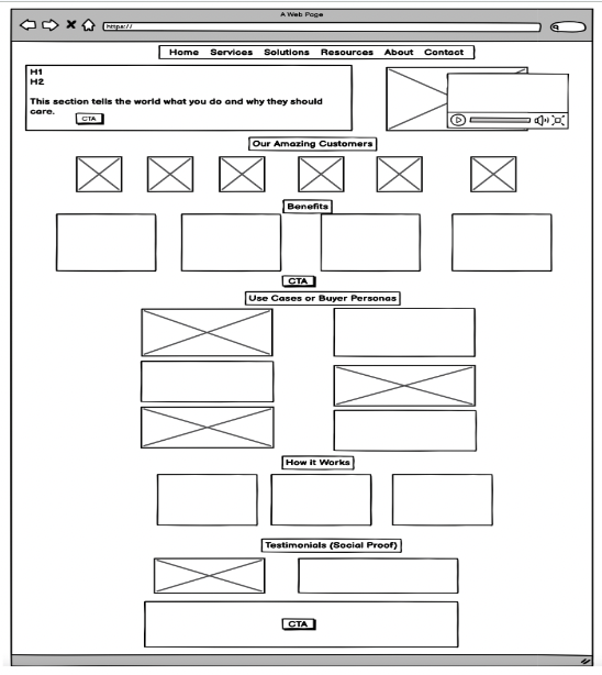
Here are the key sections and why they matter:
Hero section: It has a value proposition that clearly spells out what the product does, who it serves, the benefits and how it’s different or better.
The hero section should also display the experience of using the product like a screen capture or a video. It’s the show part of the tell-and-show approach to Websites. And no stock photos! It’s an effective way to tell the world that you’re too lazy to source original photos.
Social Proof: Logos that show that other companies have taken the plunge and lived to tell the tale. Ideally, they’re high-profile customers but there’s no harm in showcasing the success of up-and-coming companies.
Benefits (aka why your product matters to prospects). This section is about your prospects and how they’ll be successful. It’s not about your product or its features. How does your product deliver a better experience and results?
Use cases or features: Okay, now you can talk about your product, but it should be focused on how customer uses it. What are the different jobs that can be done? Keep in mind that different customers use your product in different ways; it’s not a one-size-fits-all proposition.
In some respects, use case are like a menu at a diner. You don’t want to offer too many options but one of more items on the menu should resonate.
How it Works (optional): If you want to go deeper into the product, here’s where you do it. I’m a big believer in this information because it shows people the process or steps that they will take to get value from your product. An alternative approach is creating a standalone “How it Works” page featuring copy and screenshots and/or videos.
Testimonials: Yes, they’re canned and cheesey but prospects read and believe them. It’s all about building confidence and reducing risk and hurdles.
Ideally, testimonials have photos and titles attached to them. An even better approach is video testimonials (real people saying real things about a product).
Two or three calls-to-action buttons can be on the page, and as a top-level navigation options. I’ve seen many Websites that only have a CTA at the top and bottom of the page. It’s a mistake because you can’t assume someone will scroll the entire page. And if you don’t tell them what to do before that, they may not do anything.
At a high-level, this is the recipe for a success B2B SaaS homepage.
More: On June 13, I’m doing a workshop on how to turn your homepage into a conversion machine. Register for free.


